Welcome to the 301st post on GTH. We are constantly looking at ways to empower the bride of Christ into the fullness God has called us into. Today we’ll discuss a bit about logo designing. A logo is a key identity point for a ministry or church. Every church/ministry has a logo today, but the question is: Does it hold for the design awesomeness we live in today? Is it up-to-date with the target audience that you cater to and with the advances in design?
I enjoy studying the creativity and art in web and logo designs. It’s amazing how people can create something beautiful out of actually nothing.
I am in touch with a few young leaders with whom I have been working with on their website and logo designs. I thought it would be nice to share the knowledge that I have gained as a result of this learning for our GTH readers who are looking forward to create their own logo designs. I have also included church logo ideas for your inspiration.
Select Your Logo Type
There are three ways you can go about finalizing your logo:
 a) Symbolic Logo
Your logo can be either visually symbolic or iconic (Eg: the apple logo, nike logo, like a musical note for a music store, books for a book store)

b) Wordmark Logo
You could go with a logotype. It uses a recreated font, without graphics. (Eg: the google logo, McDonald’s logo..)
 c) The Above Combined
The best of both world – your logo contains both a logotype and a graphic image in the logo. (Another eg: SMMinistries logo 😉
Five Pointers to Keep in Mind
1. Objective
Start with your core objectives and based on that proceed further. As far as possible avoid having the sun, moon, stars, water, fire or the Bible in your logo. At one point every logo had a dove, (I guess mostly popularised by Pastor Benny Hinn’s logo). I was one of among them – young, excited and undecided – so I decided to go for a dove too, till about 5 years ago before we got our logo redesigned.
Finally it had to boil down to what we really stood for. Our focus was: To see God’s hand on the nations of the earth – bringing revival and souls. As you can see our logo, the wheat sheath stands for the harvest, along with our re-designed ministry name.
To re-emphasize what i said earlier, ask yourself: Does your logo inspire trust and admiration? It is important that you find out what is the core objective is and stick to that. Action plan is to sit with your team and brainstorm!
2. Sketch It
“Every awesomeness is birthed in the heart but best when it starts on a paper.” < Click to tweet this
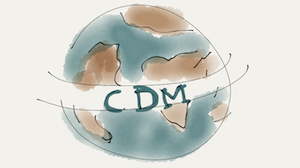
This exercise allows you to get more creative and try out something before trying to get it concretely done on your computer. If you are not too much of an artist, get someone who can draw and try to explain to him what you are visualising.
3. Simplify It
A logo’s success is the simplicity of it and not the complexity!
The simpler your logo is, the more memorable it will be. Use the K.I.S.S. principle – Keep It Simple Silly! Don’t splash your logo design with metaphorical meaning, or complicate the design using what everyone is using. Your aim should be: Easy to distinguish from a distance and good visual recall and memory retention. All this is only possible through clean and simple designs.
Google, Apple, Nike, Mercedes Benz – are a few great examples of brands with simple, yet effective logos. (Oh, by the way did you know that the Nike’s logo was designed for $35.00USD!)
At this point a designer may choose to use an Adobe Illustrator to give the finishing touches for the logo.
4. Black and White
The full proof test of your logo is to see how your logo looks in Black and White. If your logo does not look good in the simplest form then you have failed the test.
For a logo, the composition of the design element is more important than the colour.
5. Colour
Once you have the wow factor on your logo, work on the colour combinations. Start by planning a brand color for your logo. Again, don’t have all the colors in the rainbow.
Use solid colours instead of effects and overt use of gradients. And keep the color consistent throughout your brand. Have a strategy behind why you choose those colours.
Of course there can be exceptions in creativity. Just for your information when Google’s designing team was choosing colors for the logo, they ended up with primary colours first then instead of following the pattern they used a secondary colour on the L, which stood for the idea that Google doesn’t follow the rules. They wanted to be known as a company more than just a search engine.

A Note About the Tagline
I suggest you should create your tagline independent of your logo. Intertwining both these makes it harder to use one independent of other. Instead design them as separate pieces and use them when necessary.
Other Resources:
More Church Logo Ideas:
Tutorials:
http://tutorials20.com/category/design
http://lynda.com
http://ideabook.com/tutorials
Church Branding Ideas:
Church Branding Ideas
Freebies:
Free Textures, Backgrounds
Sketch your ideas:
Mike’s Sketch Pad
Paper by Fifty Three for iPad
Secular Inspirations:
10 Successful Logo Redesigns
10 Principles of the Logo Design From the Masters
Step by Step Creation of FITUCCI Logo
Discuss:
Have a question? If you are a designer what would you add?
Also leave your site link if you are available for work AND don’t forget to mention if you offer a discount for churches and ministries 🙂
If you have a sketch or a logo you are designing, you can upload it in the comments section below.
More Reading For Ministries:
- 5 Easy Steps to Create a Facebook Page for Churches and Ministries
- Multiple Site Church Services Through Video!
- Blogging for Christ
- Is Your Church Twitterrific?


